How to code the Inspector Controls – the settings sidebar of Gutenberg blocks?
Share
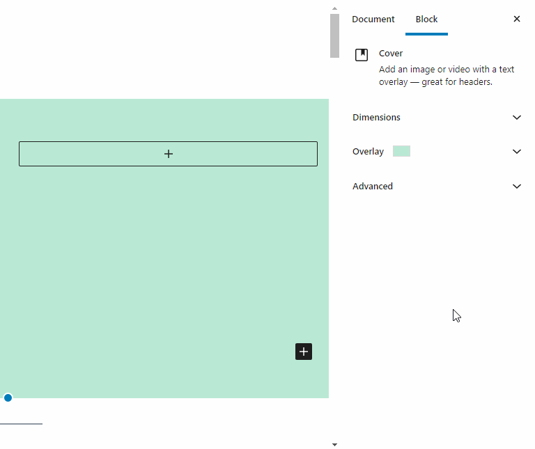
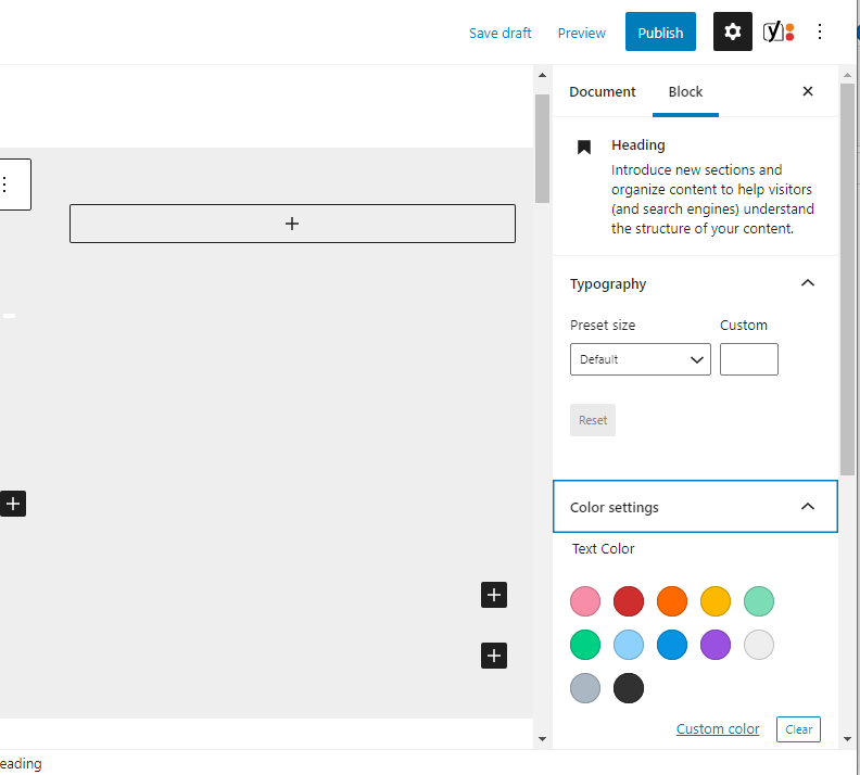
What are the Inspector Controls?
The Inspector Controls are the settings in the sidebar of Gutenberg blocks. When a block is selected in admin, you will see the settings of the blocks under the ‘Block‘ tab of the sidebar. Typical settings you will find here are color selectors, on/off switches, size selectors, and variable dropdowns.
The Inspector Control React Component
For the WordPress developer, the Inspector Controls (<InspectorControls>) is a React component used within the edit-function of a Gutenberg block. Any child of the Inspector Controls will show up in the sidebar while editing the block in the WordPress admin. Below is a minimal edit function of a Gutenberg block using a ‘FormToggle‘ control (switch on/off) inside the inspector controls.
import { InspectorControls } from "@wordpress/block-editor";
import { Fragment } from "@wordpress/element";
import {
	PanelBody,
	FormToggle,
} from "@wordpress/components";

const edit = (props) => {
	const { className, attributes, setAttributes } = props;
	const { show } = attributes;

	return (
		<Fragment>
			<InspectorControls>
				<PanelBody title="Settings" initialOpen={false}>
					<FormToggle
						label="Should text be shown?"
						help={show ? "Yes" : "No"}
						checked={show}
						onChange={() => setAttributes({ show: !show })}
					/>
				</PanelBody>
			</InspectorControls>
			<div>
				My Block Content
			</div>
		</Fragment>
	);
};
Inside of the <InspectorControls> you find a wrapper component called <PanelBody>. It divides the settings area into sections that can be toggled to open and close.
Inside of the <PanelBody> is the actual wordpress native form control. You may use a regular html checkbox instead – but it gives a consistent feeling to stick to the native wordpress controls available in the WordPress components library.
You will use the control components to set your block attributes (the data that is saved in the database and passed to the save function).
Hoped this gave an introduction to the settings panel of Gutenberg blocks. In the coming posts, we will go through the most useful controls in the components library. Stay tuned!
More tutorials
How to use multiple post types in a Query Loop Block
Currently the Query Loop only supports one post type. In this article we will show how we add multiple post types to query using the pre_get_posts action.
Read more How to use multiple post types in a Query Loop Block

How to add filters and search to the WordPress Query Loop Block
It has been a pain to add filters and search to your feeds in Gutenberg. Not any more, we will teach you how.
Read more How to add filters and search to the WordPress Query Loop Block
Learn Gutenberg block building – Create a block that renders an ACF field
With this tutorial, you’ll learn how to create a custom Gutenberg block that displays an ACF field on the front-end of your website.
Read more Learn Gutenberg block building – Create a block that renders an ACF field
