WordPress editor controls
Toggle Control – Coding Gutenberg block settings

Share
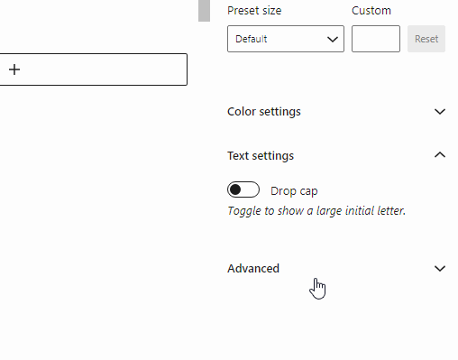
Adding the toggle control to the inspector sidebar of your block
The Toggle Control is basically like a checkbox, a boolean control, or if you will, an on/off switch. It’s by far the most common control we use when building blocks. It has a boolean value, so it’s either true or false.
The Toggle Control is part of the WordPress components library. Below is an example of it’s properties:
import {
    ToggleControl,
    //  FormToggle, --- same component
} from "@wordpress/components";

// or
// const { ToggleControl } = wp.components;

<ToggleControl
    label="Should text be shown?"
    help={show ? "Yes" : "No"}
    checked={show}
    onChange={() => setAttributes({ show: !show })}
/>
Here is a full example of how it is used inside the Inspector Controls component inside an edit function of a block:
import { InspectorControls } from "@wordpress/block-editor";
import { Fragment } from "@wordpress/element";
import {
	PanelBody,
	ToggleControl,
} from "@wordpress/components";

const edit = (props) => {
	const { className, attributes, setAttributes } = props;
	const { show } = attributes;

	return (
		<Fragment>
			<InspectorControls>
				<PanelBody title="Settings" initialOpen={false}>
					<ToggleControl
						label="Should text be shown?"
						help={show ? "Yes" : "No"}
						checked={show}
						onChange={() => setAttributes({ show: !show })}
					/>
				</PanelBody>
			</InspectorControls>
			<div>
				My Block Content
			</div>
		</Fragment>
	);
};
Read more tutorials
Top 50 WordPress Blogs to market your WordPress product (2024 edition)
Discover the top 50 WordPress blogs to market your WordPress product in 2024. Learn effective strategies and stay tuned for more tips on boosting your plugin, theme, or tool’s visibility.
Read more Top 50 WordPress Blogs to market your WordPress product (2024 edition)
How to use multiple post types in a Query Loop Block
Currently the Query Loop only supports one post type. In this article we will show how we add multiple post types to query using the pre_get_posts action.
Read more How to use multiple post types in a Query Loop Block

How to add filters and search to the WordPress Query Loop Block
It has been a pain to add filters and search to your feeds in Gutenberg. Not any more, we will teach you how.
Read more How to add filters and search to the WordPress Query Loop Block
